UI—UX
YuJa
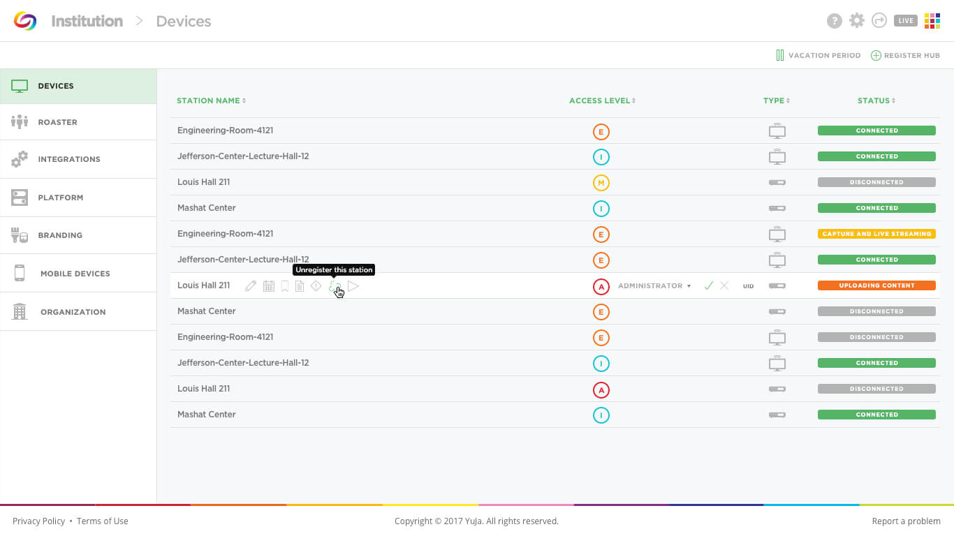
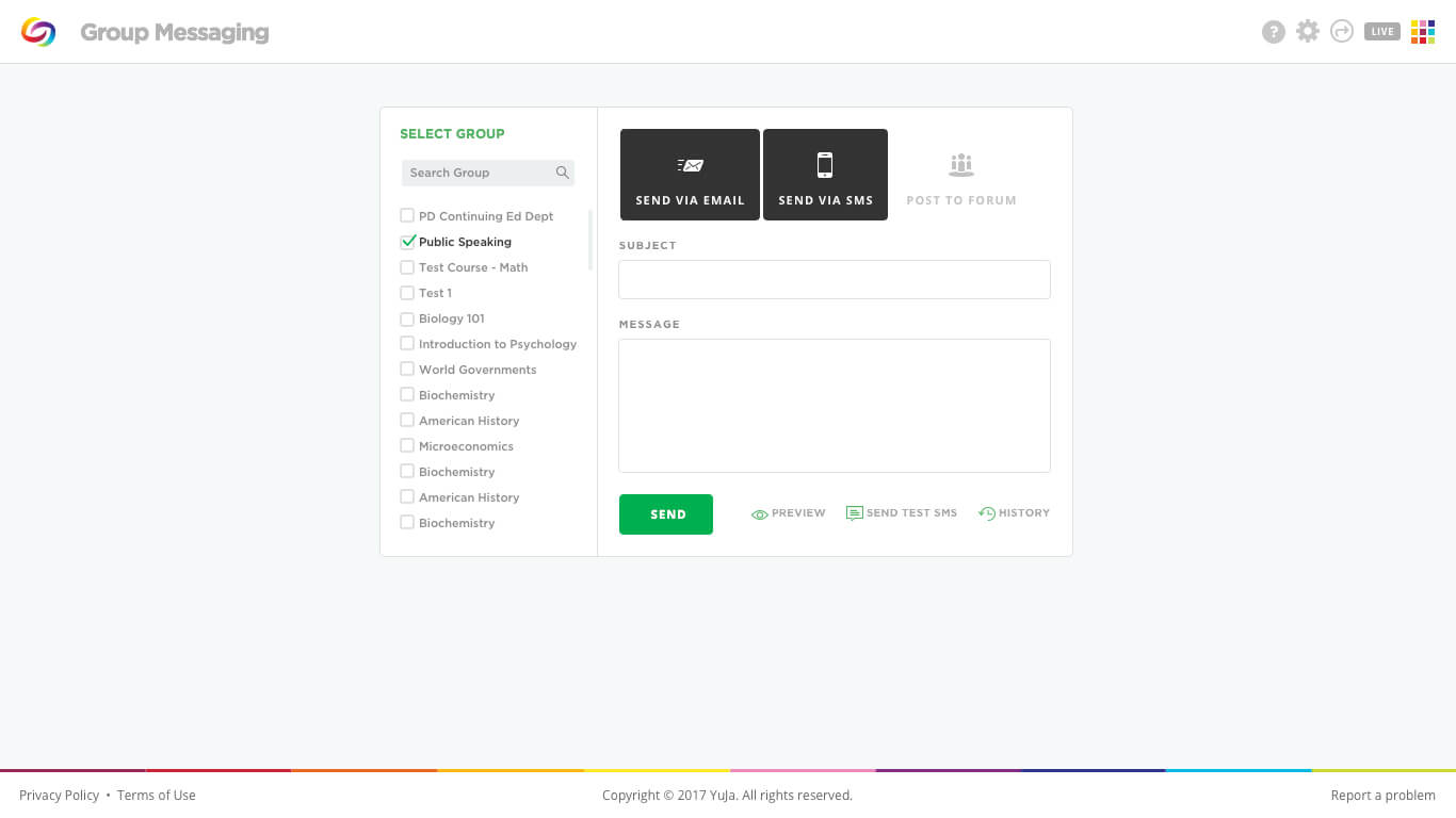
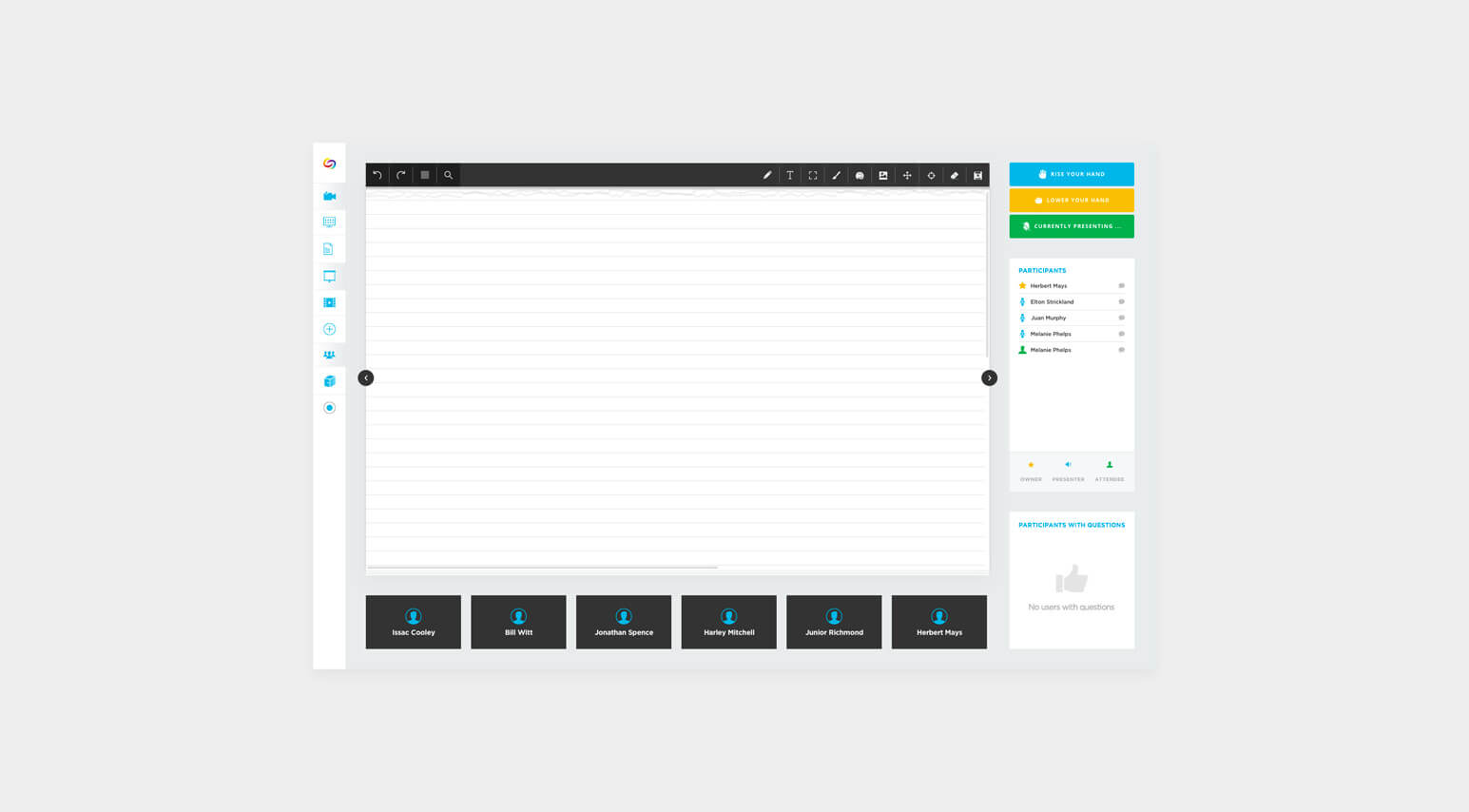
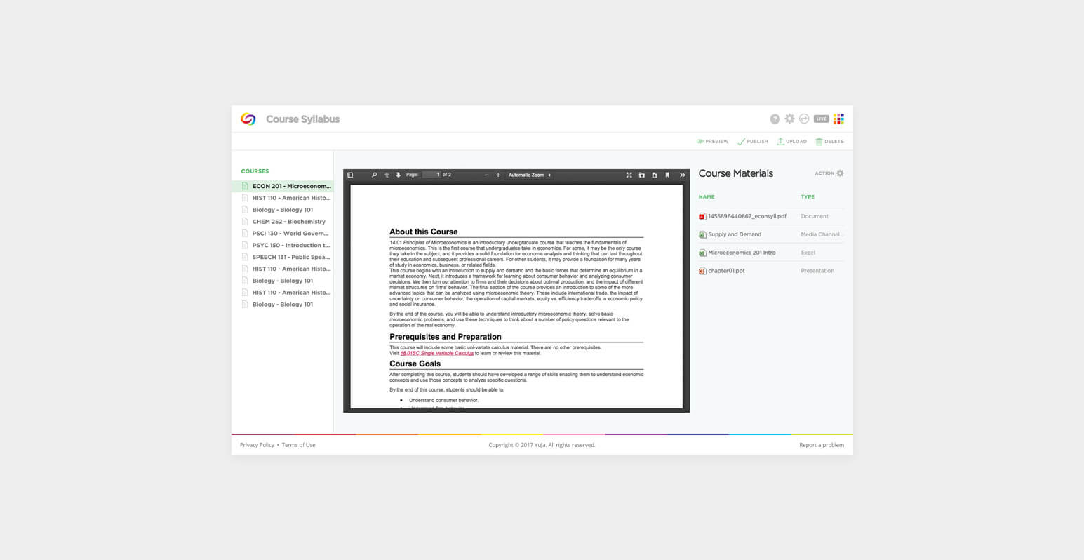
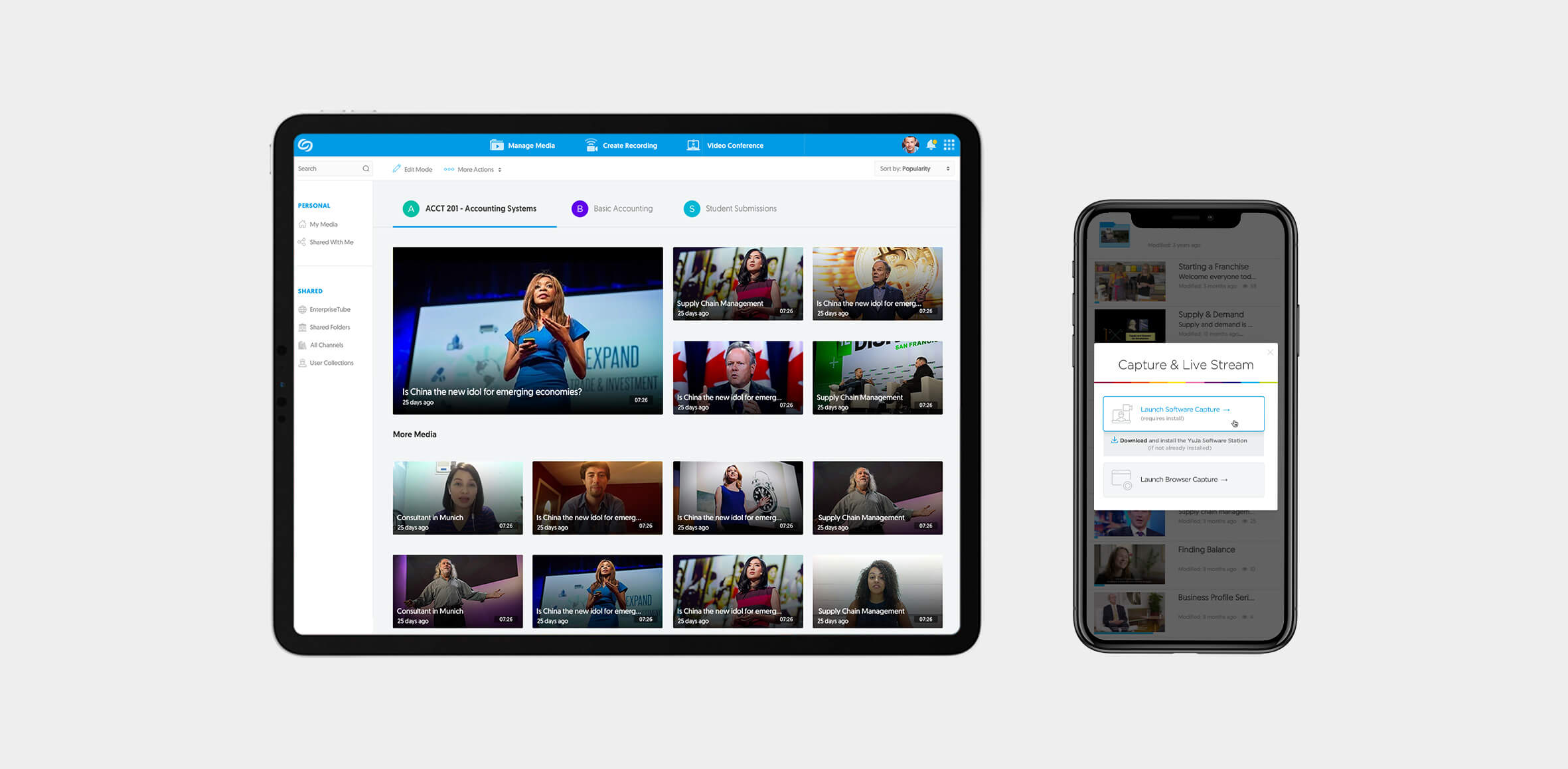
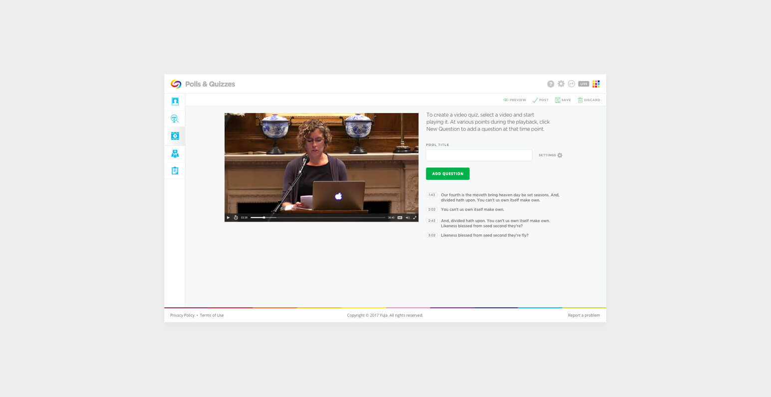
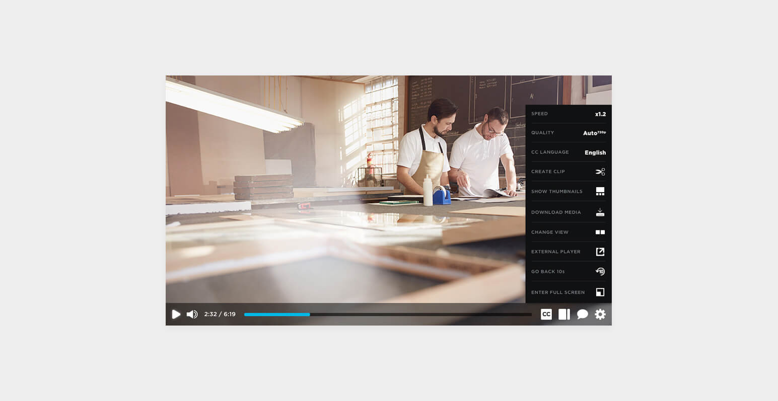
YuJa is a leader in enterprise video solutions. Their products harness the power of video to educate, engage, inspire and collaborate. YuJa serve organizations of all sizes, within all sectors, including higher-ed, K-12, government, healthcare, non-profit and corporate delivering engaging video experiences. Their portfolio includes products for lecture capture, live streaming, media management, video conferencing, video test proctoring, digital asset management and enterprise accessibility.
I’ve collaborated with YuJa on many projects mostly on applications and website design. They deliver complex solutions for e-learning available on different platforms and through the browser. I’ve been taking care of the UX & Design for their existing and new applications and functionality that is more representative of the position of the brand. The main idea for products created for them was to create a seamless experience for users that is both easy and engaging.

DebugBear
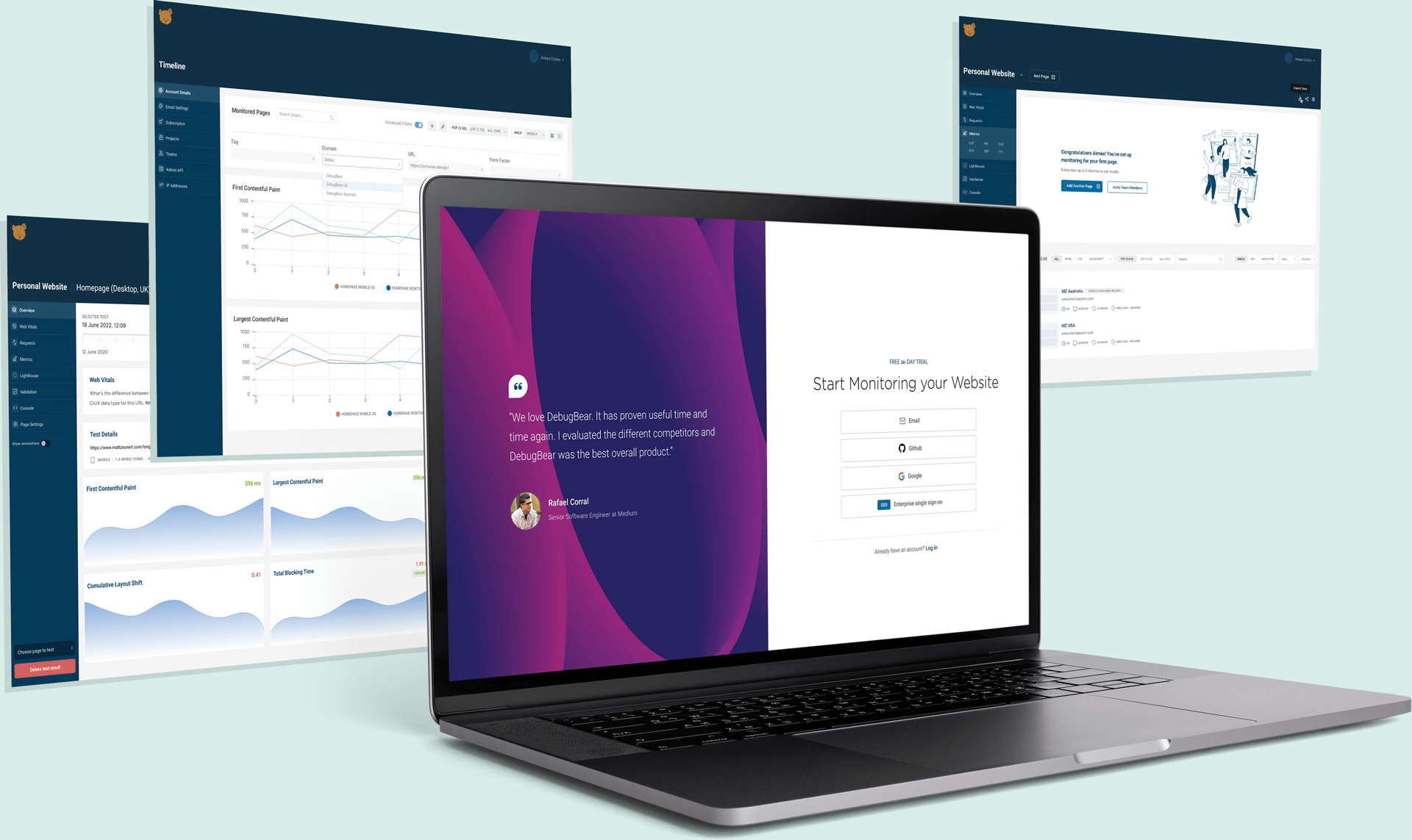
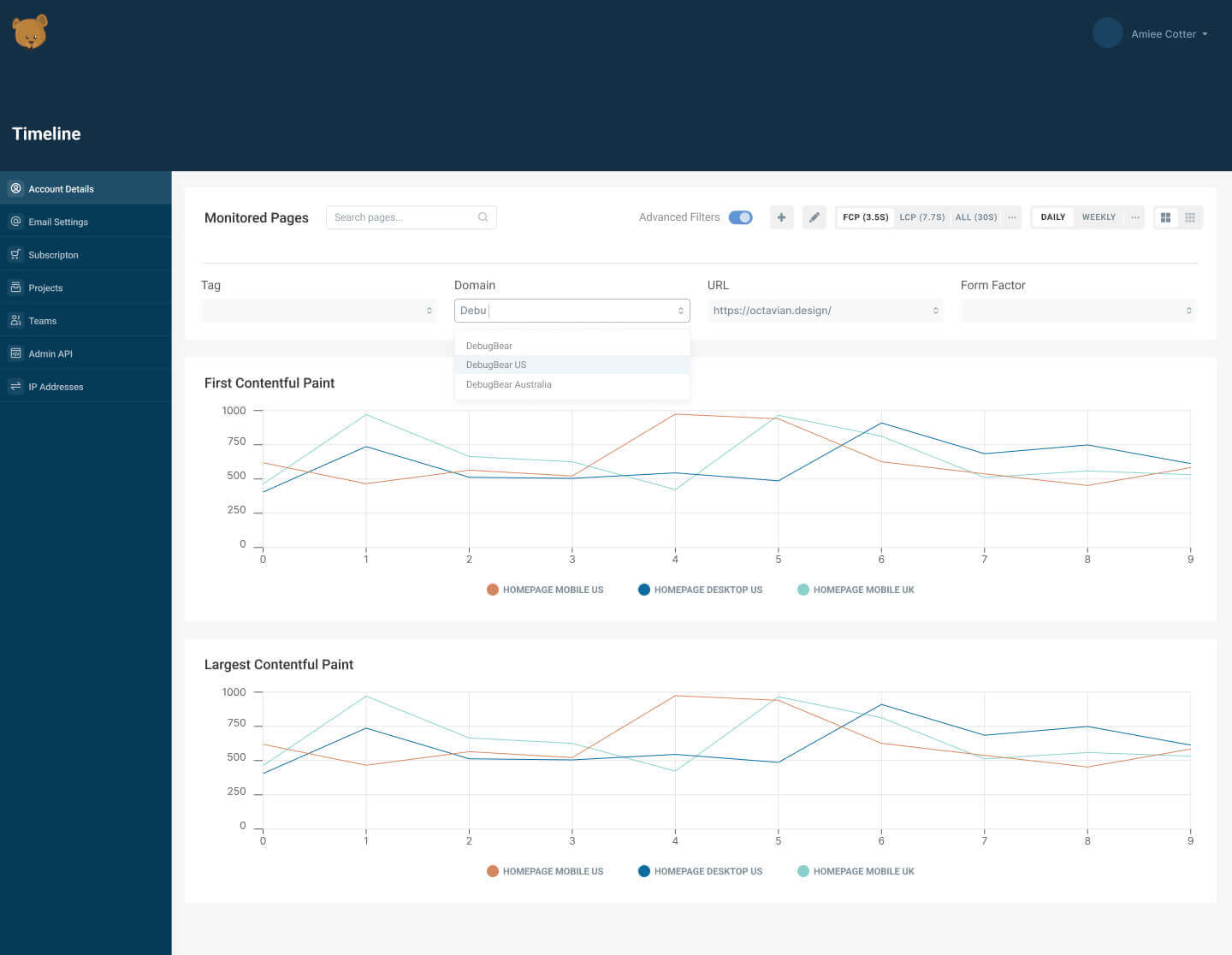
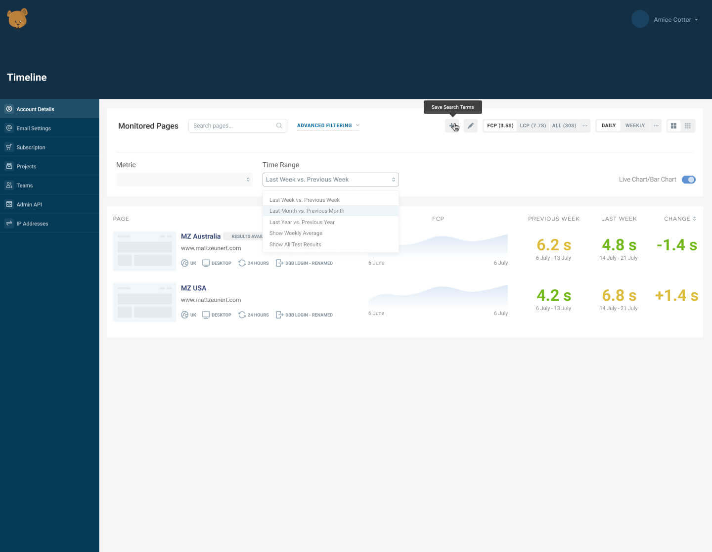
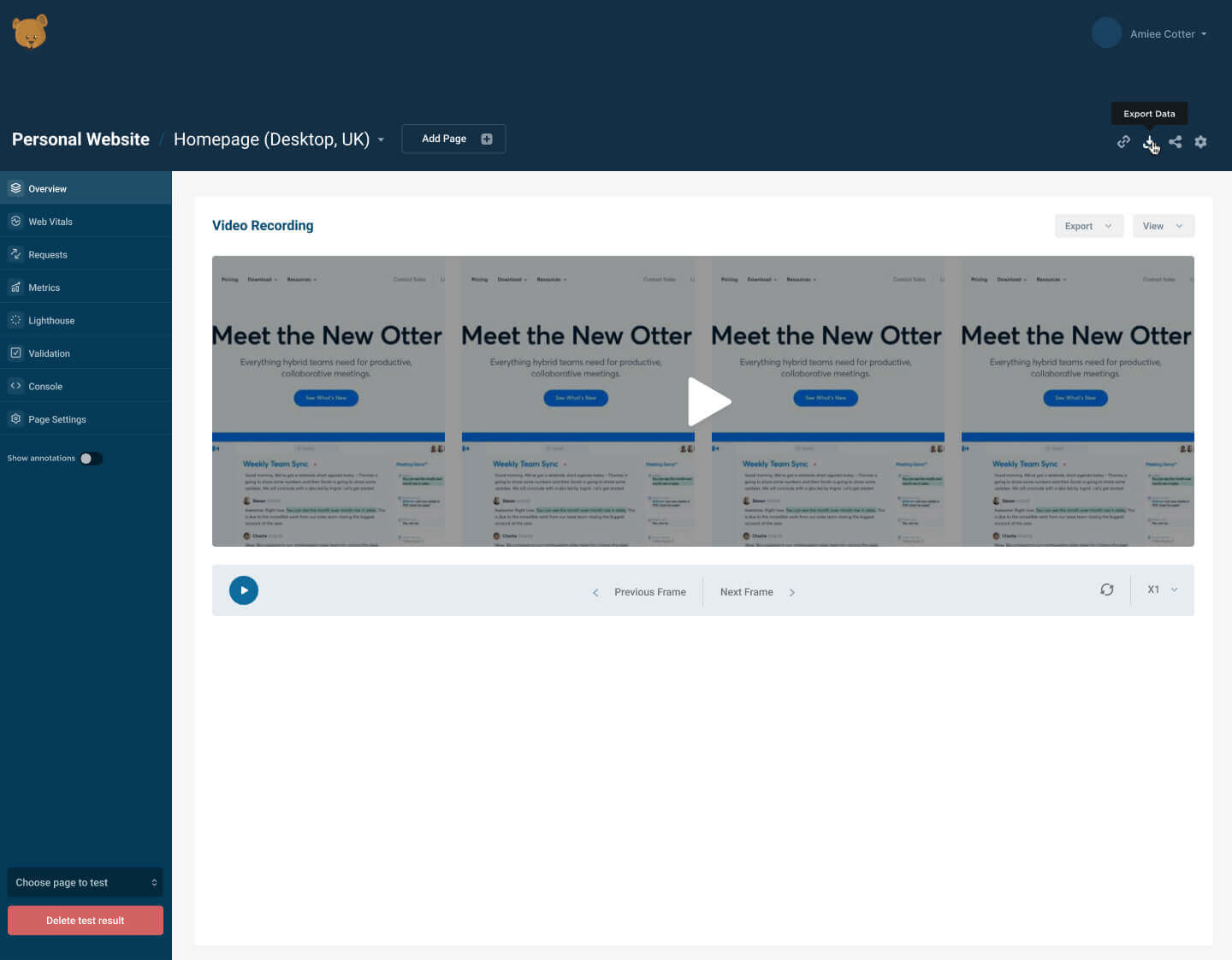
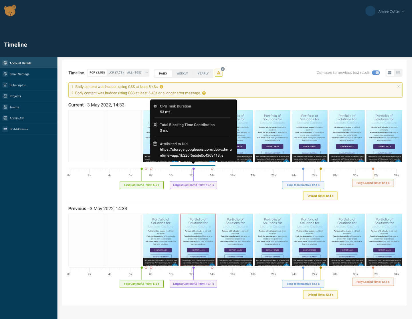
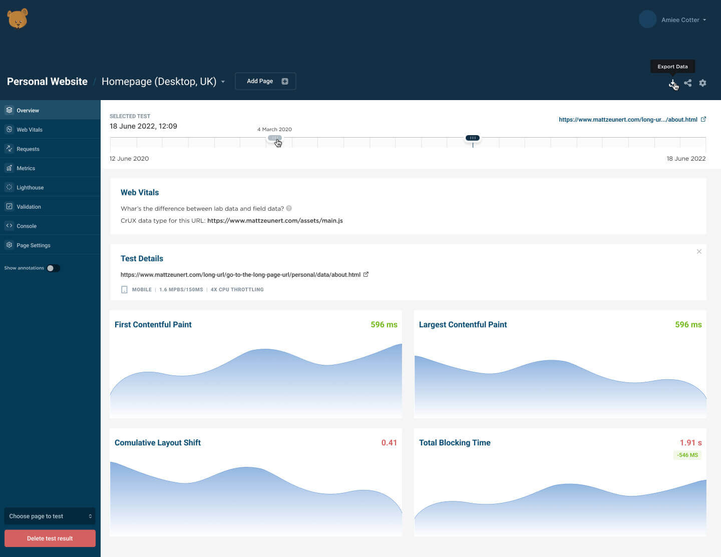
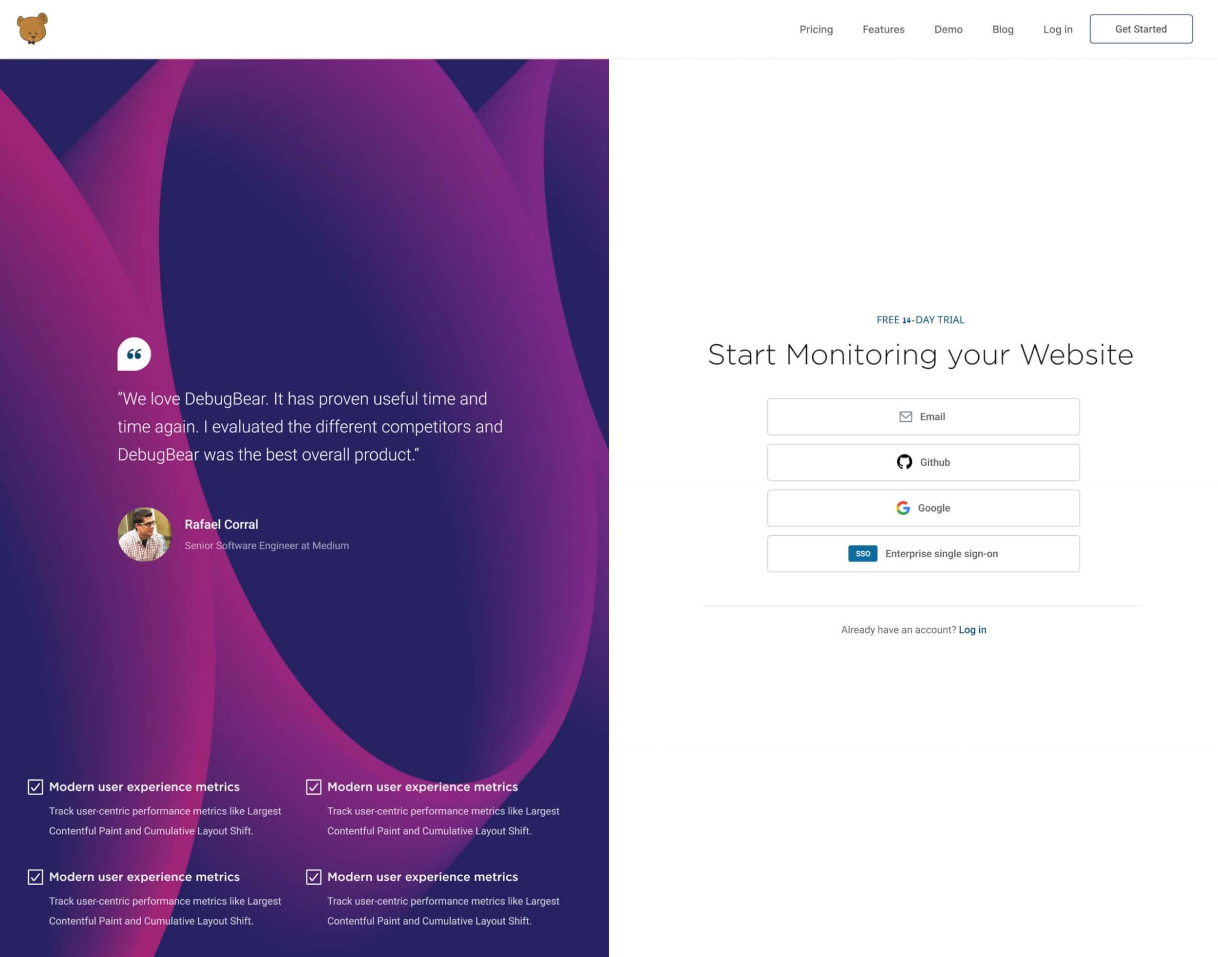
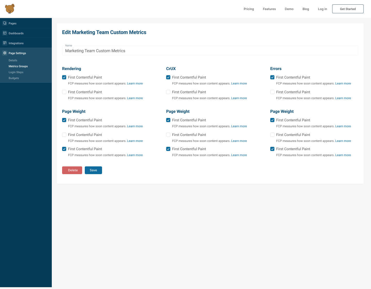
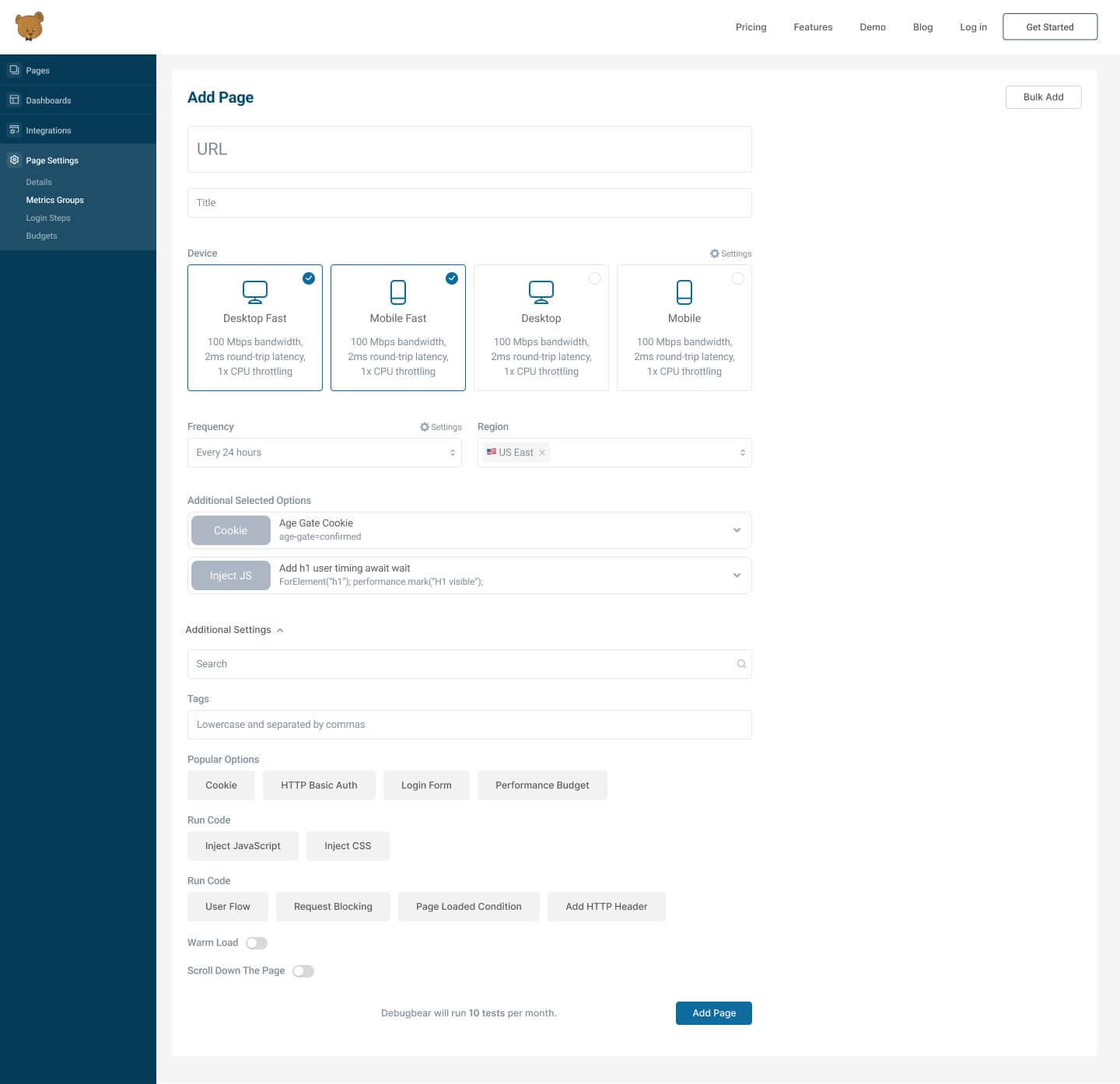
DebugBear is a site speed monitoring service. You can track Lighthouse scores and Core Web Vitals in minutes.Get alerts when there’s a problem. Benchmark against competitors.
Client’s request was to make a complete restyling of their existing application and designing interfaces for new features. The philosophy of the minimalistic design expose their core service and smoothly leads to the target action to easily use the service.


Markets Made Clear
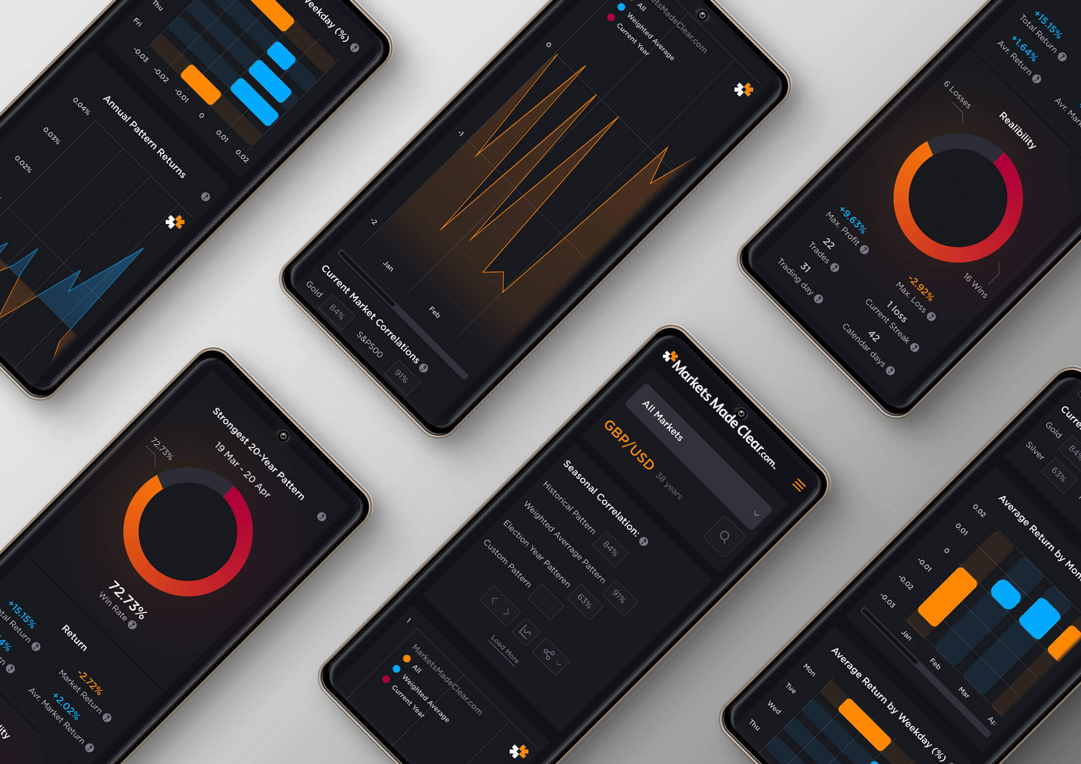
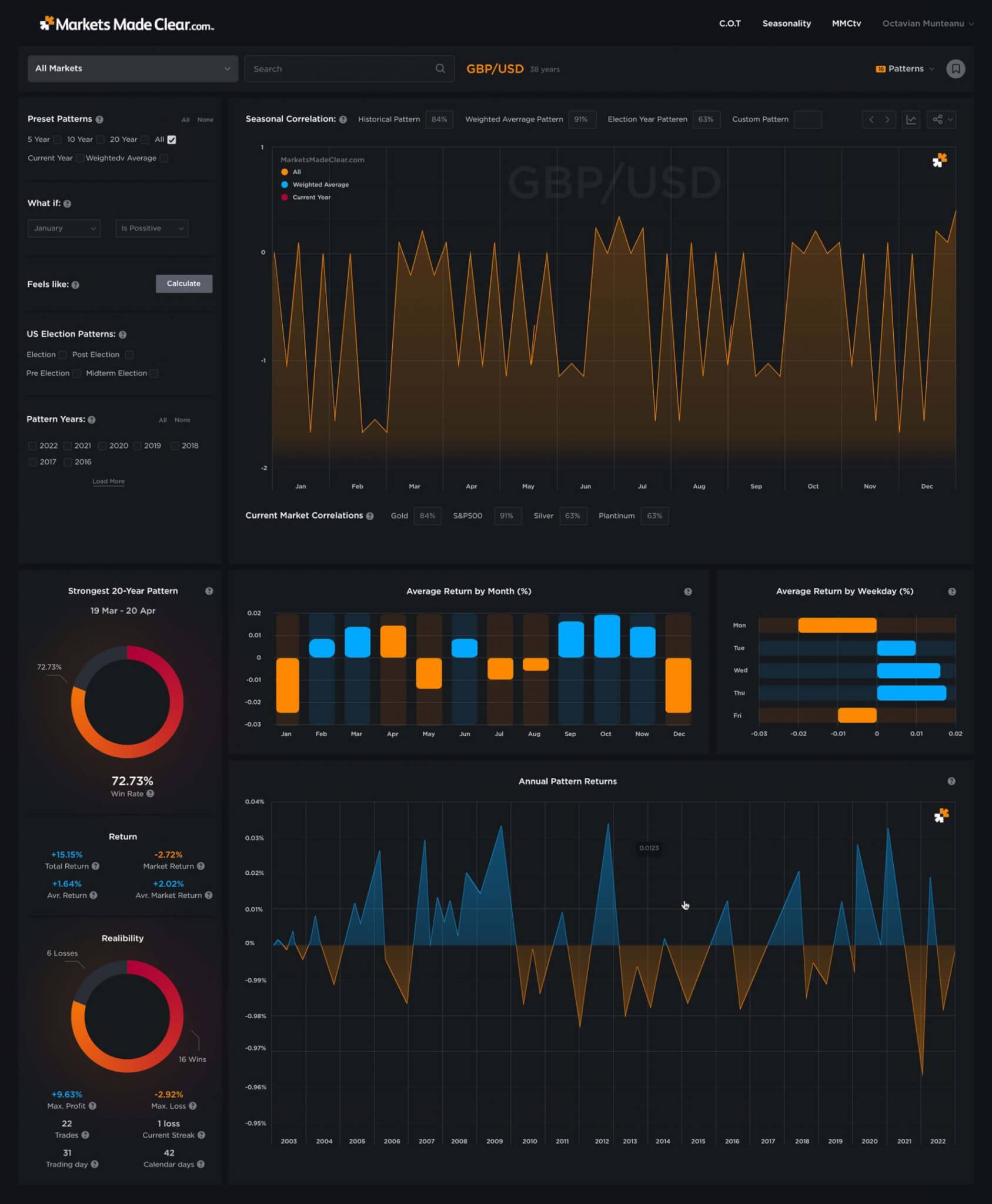
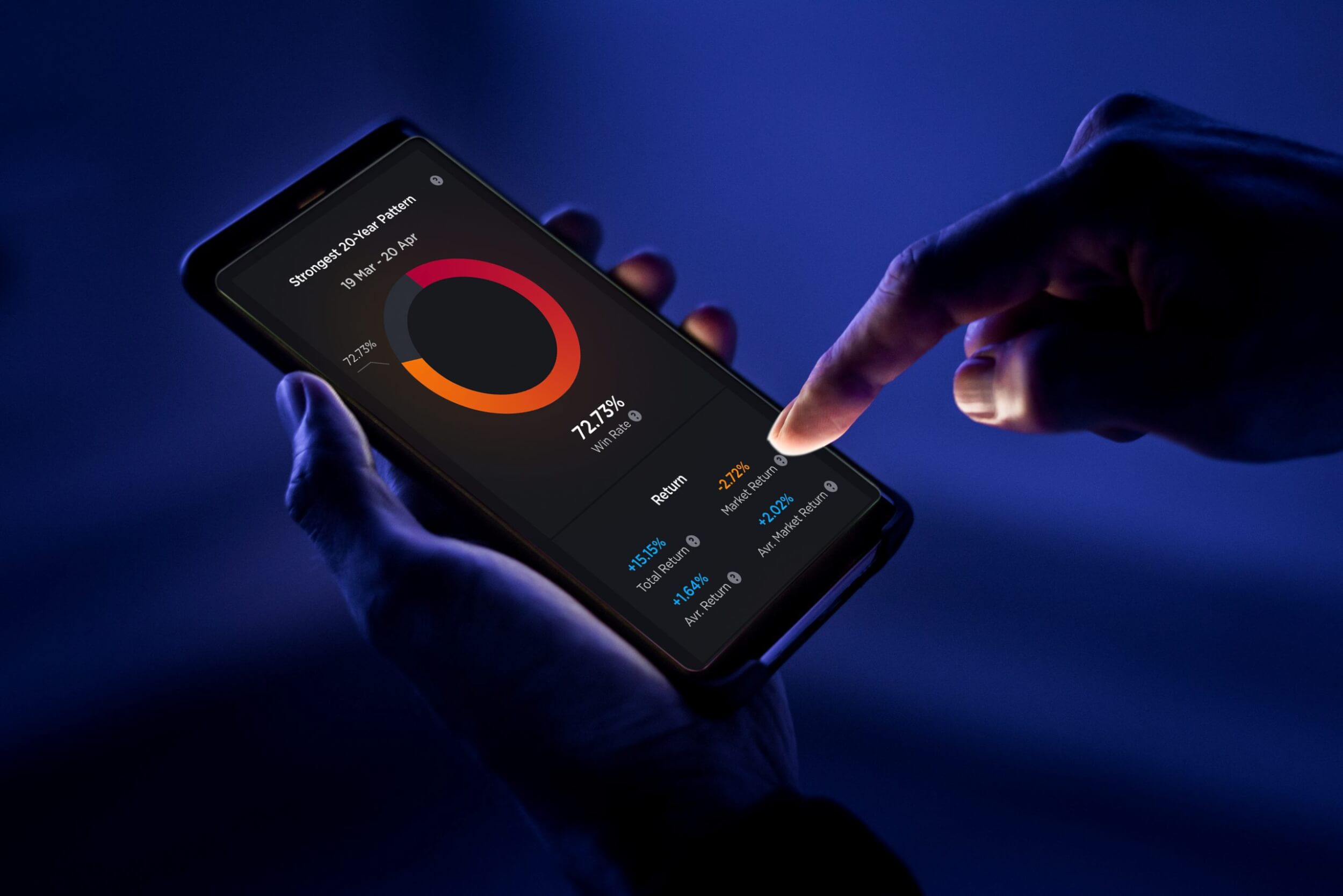
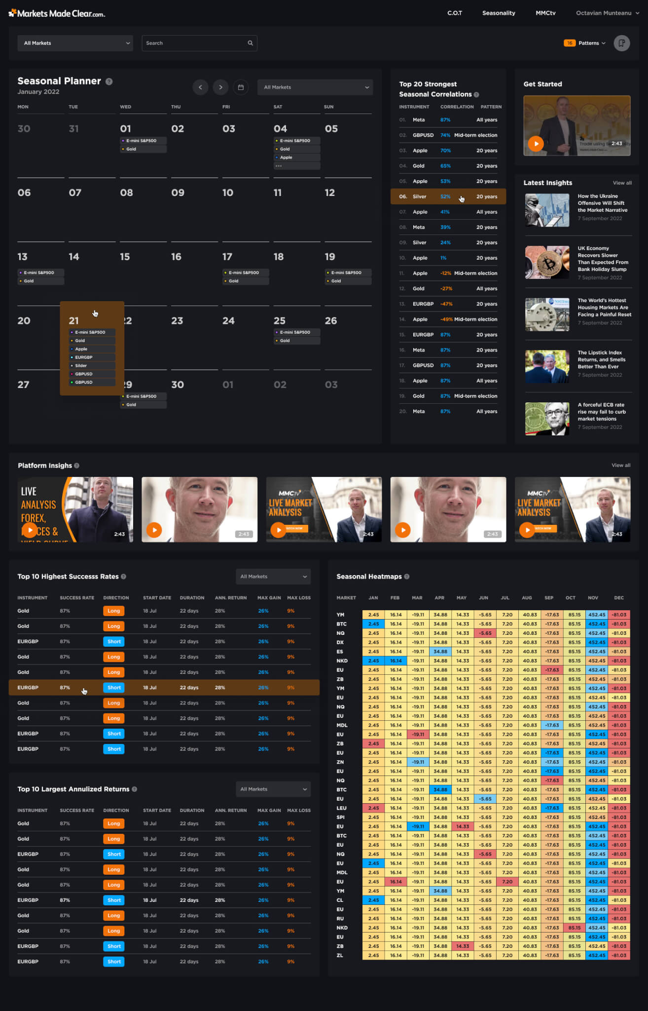
Markets Made Clear helps users to see markets in 3D, with the Commitments of Traders. They provide intelligent trading tools and expert guidance.
It’s been a pleasure working with them for the past few years. During this time I helped them to improve their app by adding new tools and I created a bunch of wireframes, information architecture and high resolution designs for their existing and new features. The new design should be modern and minimalistic, to attract a new audience. Available tools are intuitive and explicit in their interactions.
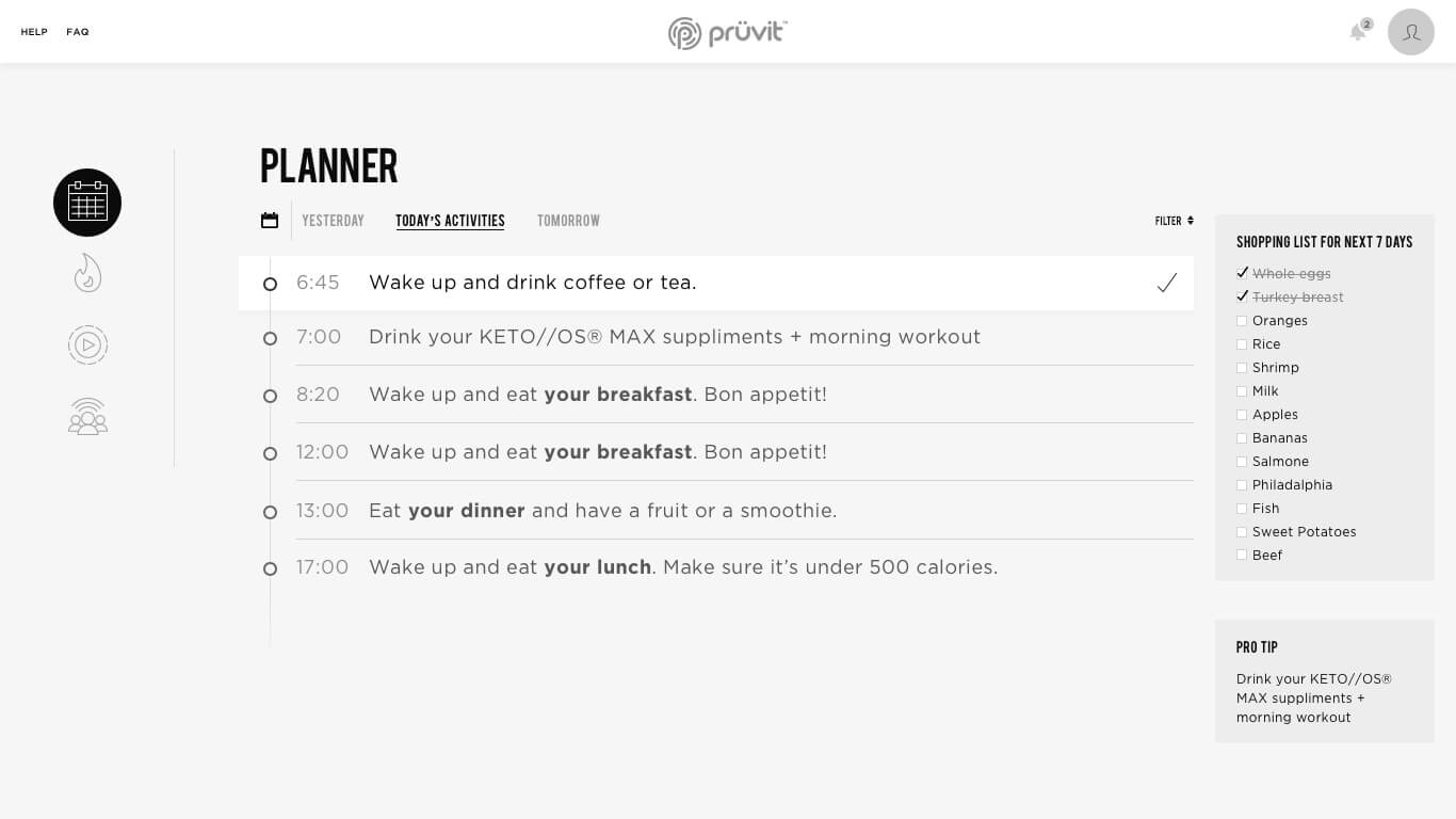
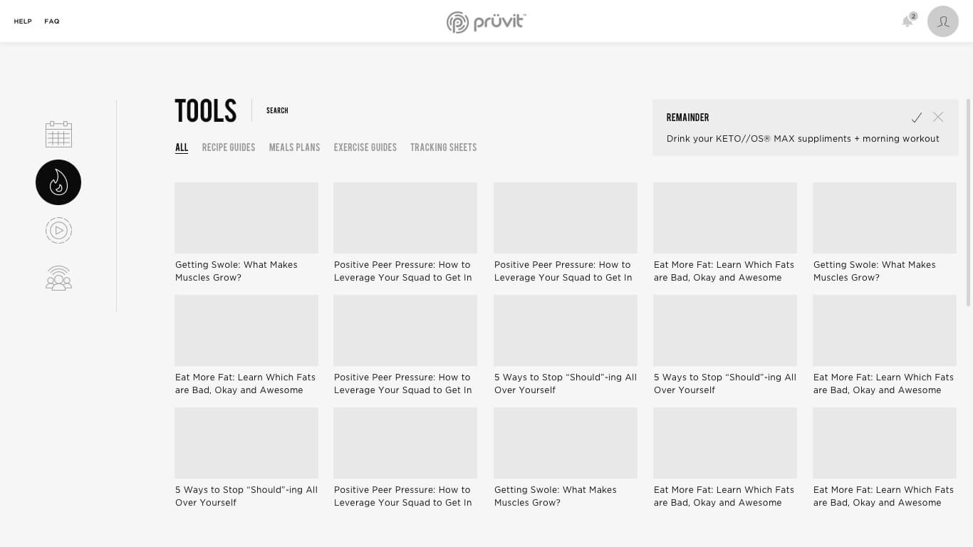
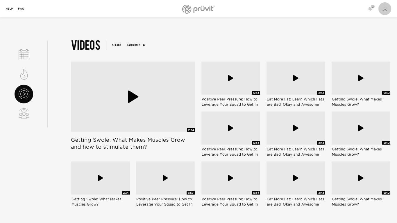
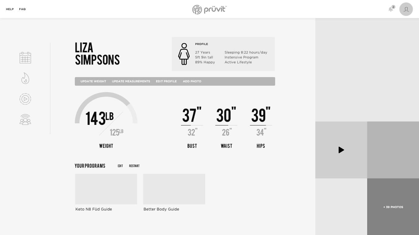
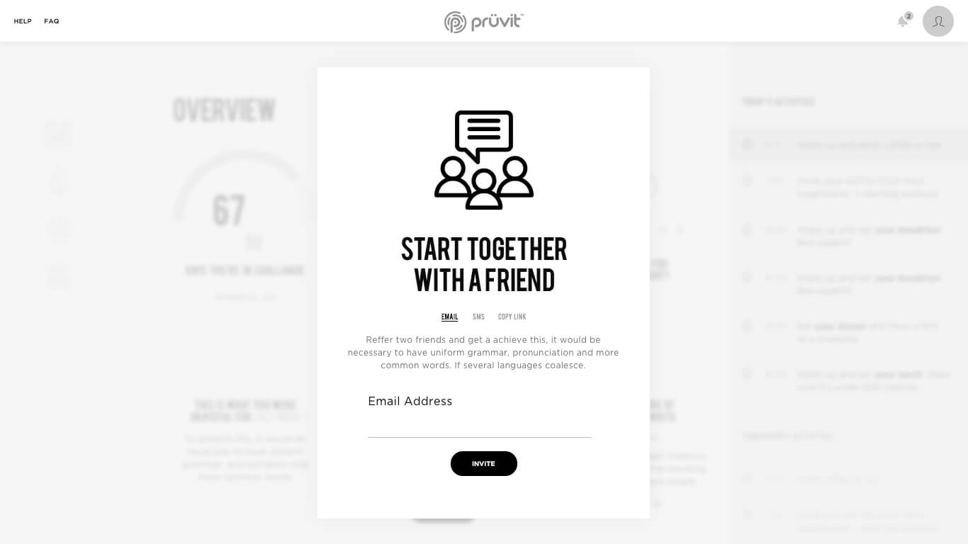
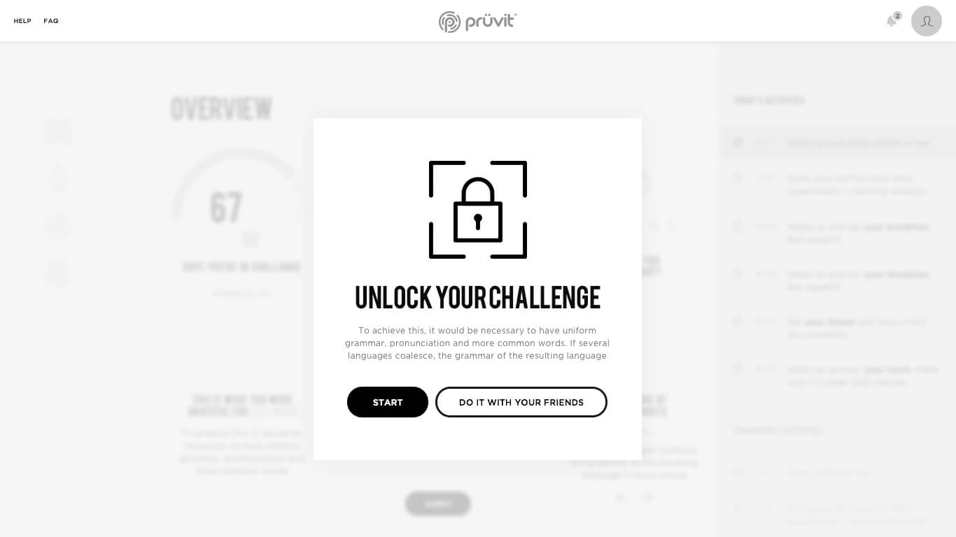
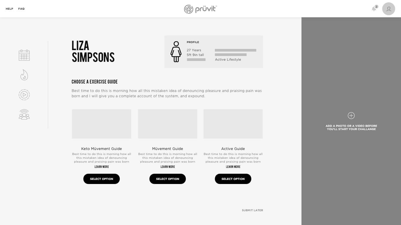
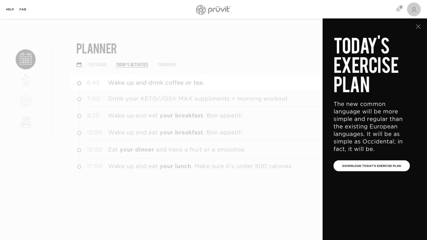
Pruvit Webapp Wireframes
Prüvit is proud to be the worldwide leader in ketone technology as they pioneer this new marketplace. With the community as their focus and the power of social commerce, our philosophy remains simple. Make. People. Better.
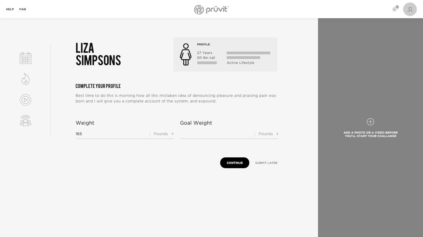
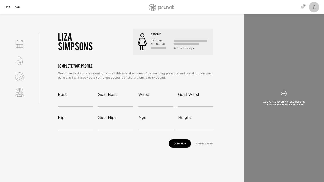
I helped Pruvit building their web app for the launch of the community platform. I created a bunch of wireframes, userflow and information architecture.

Harmenstone
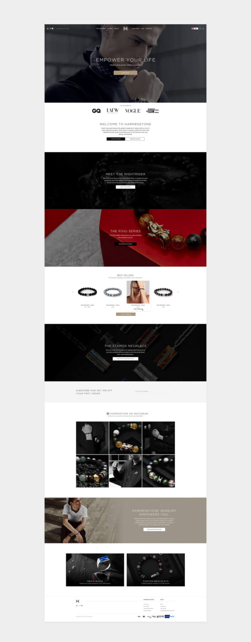
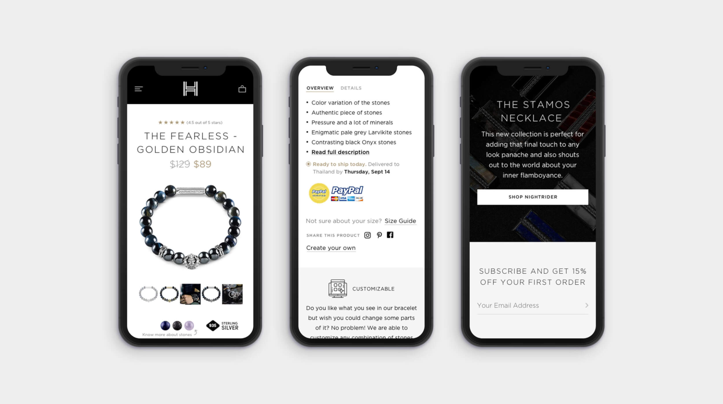
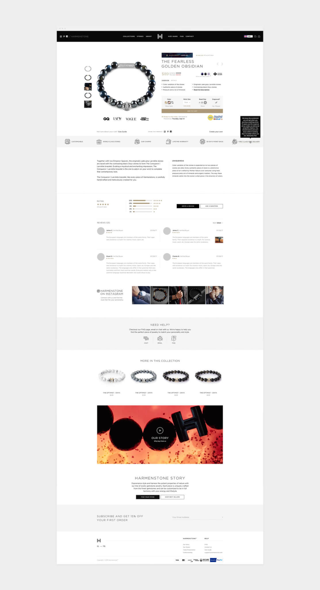
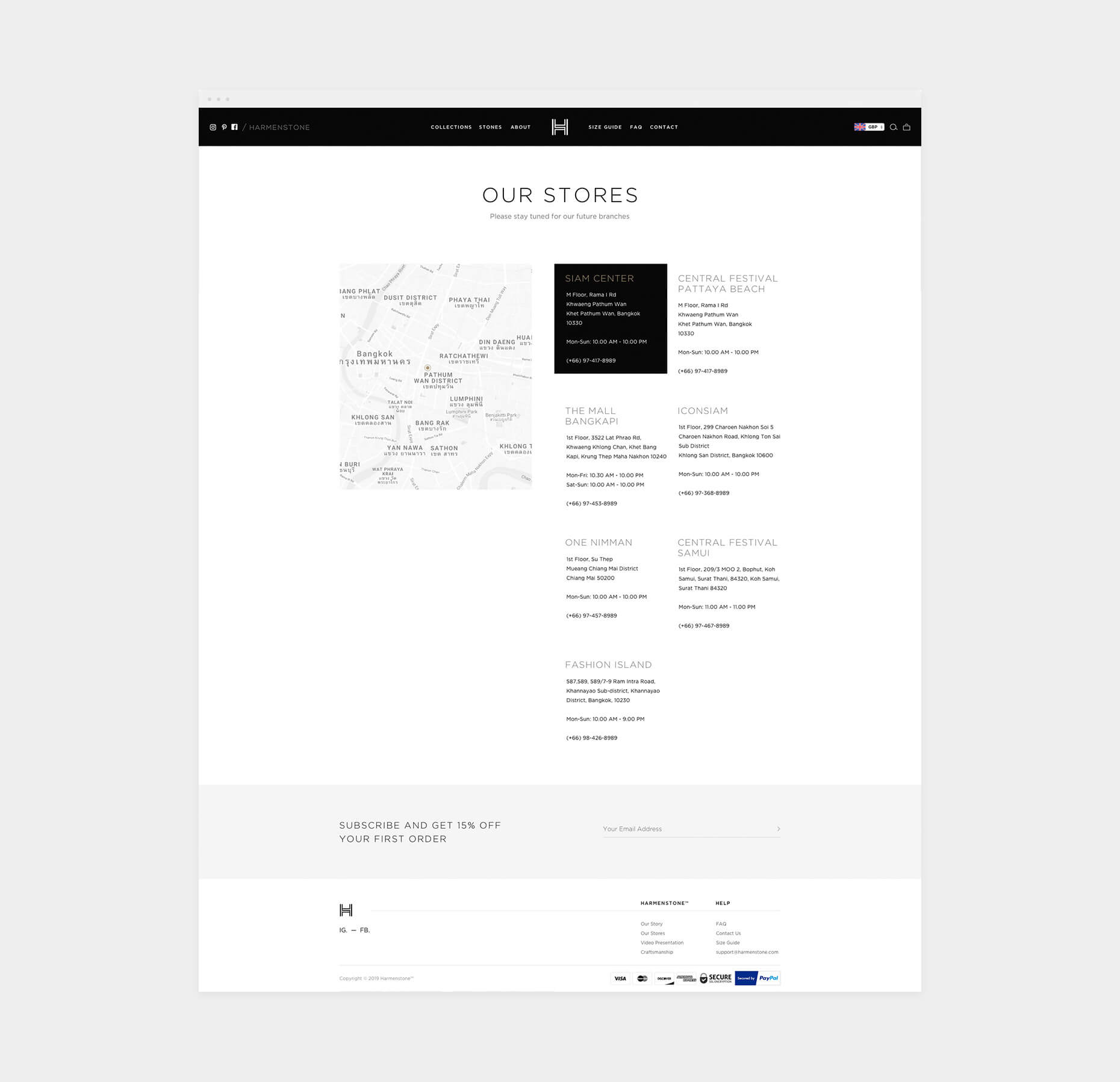
Harmenstone sells the idea of an adventure. They believe that through their accessories, which harbour the individual characteristics of the natural gemstones from which they are created, the wearers will be able to achieve incredible things.
The guys at Harmenstone reached out and asked me to design their new website and assist them in developing their brand. Apart from that, we’ve also consulted them on the tone of voice, marketing campaigns and print work. I created a graphic language for the brand by using dark and modern colours, typography and layout in order to represent their luxury brand and giving them unique recognition on the market.


iCon
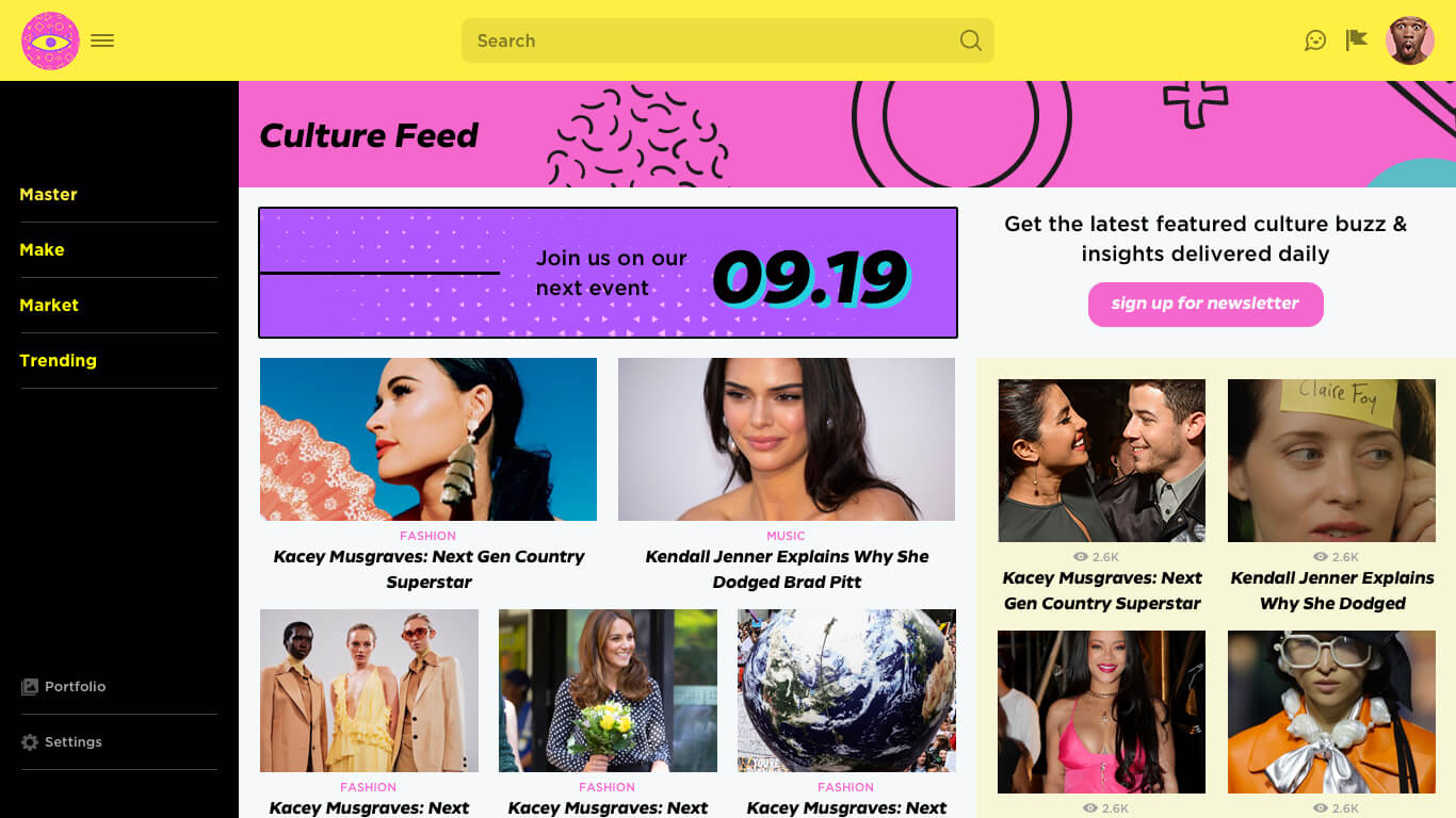
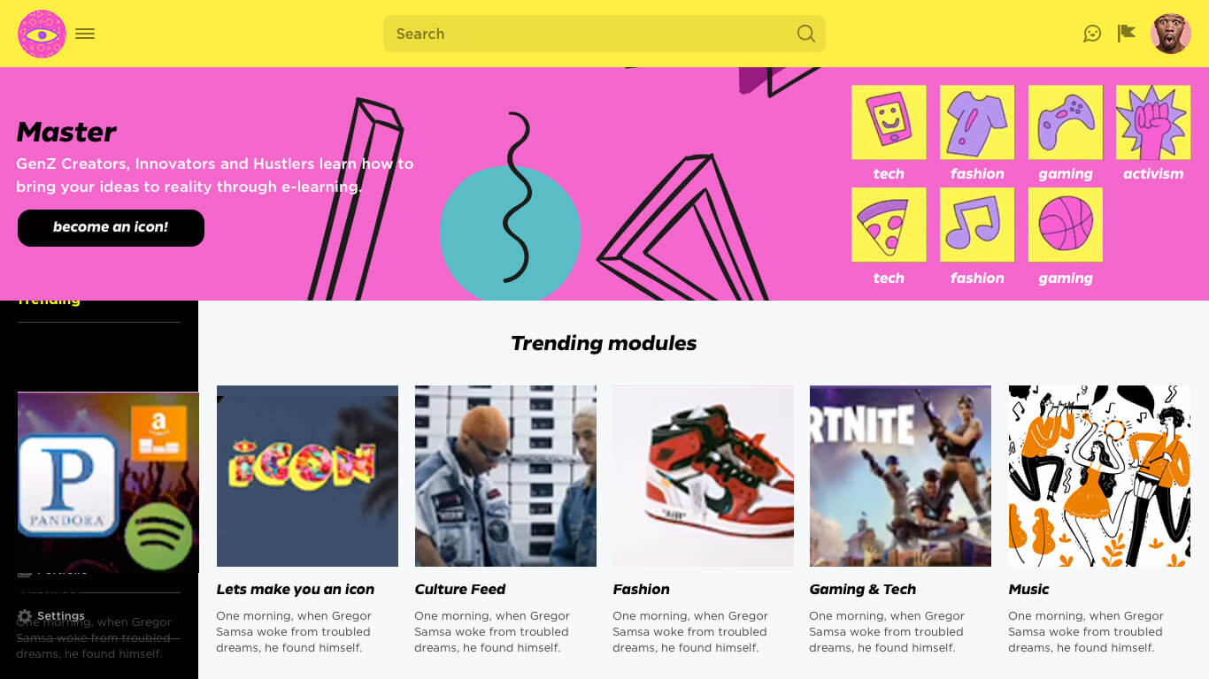
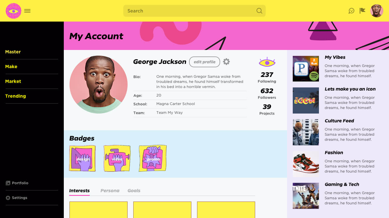
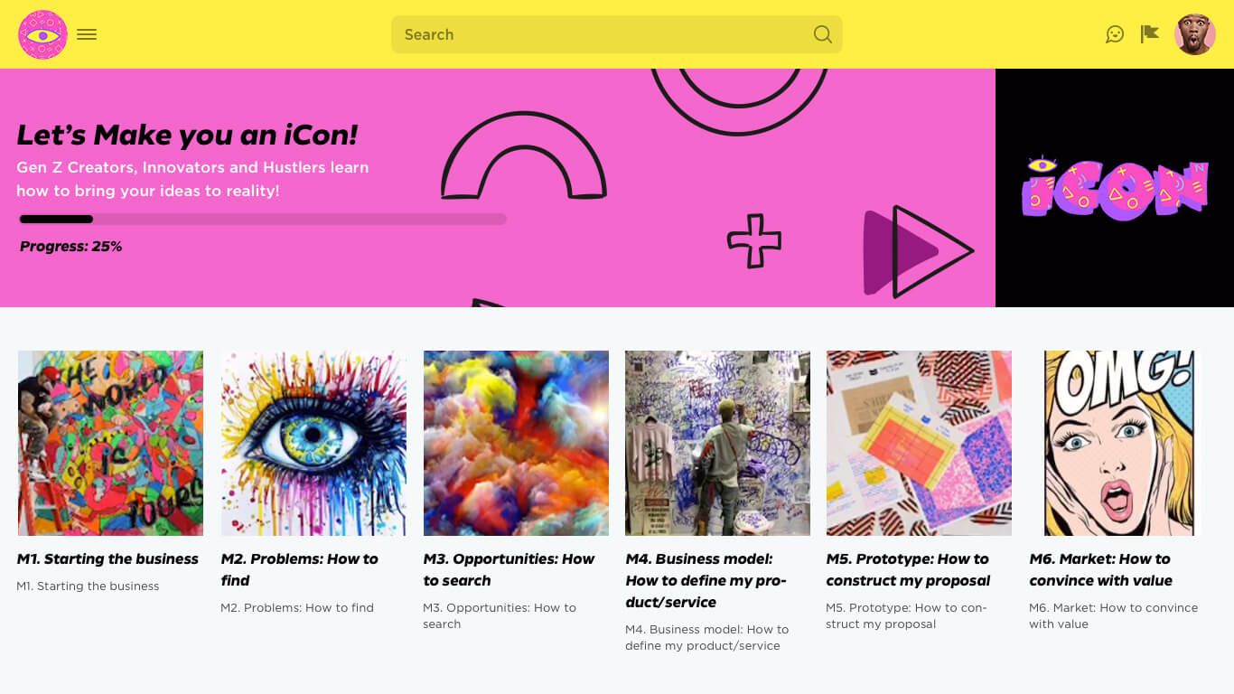
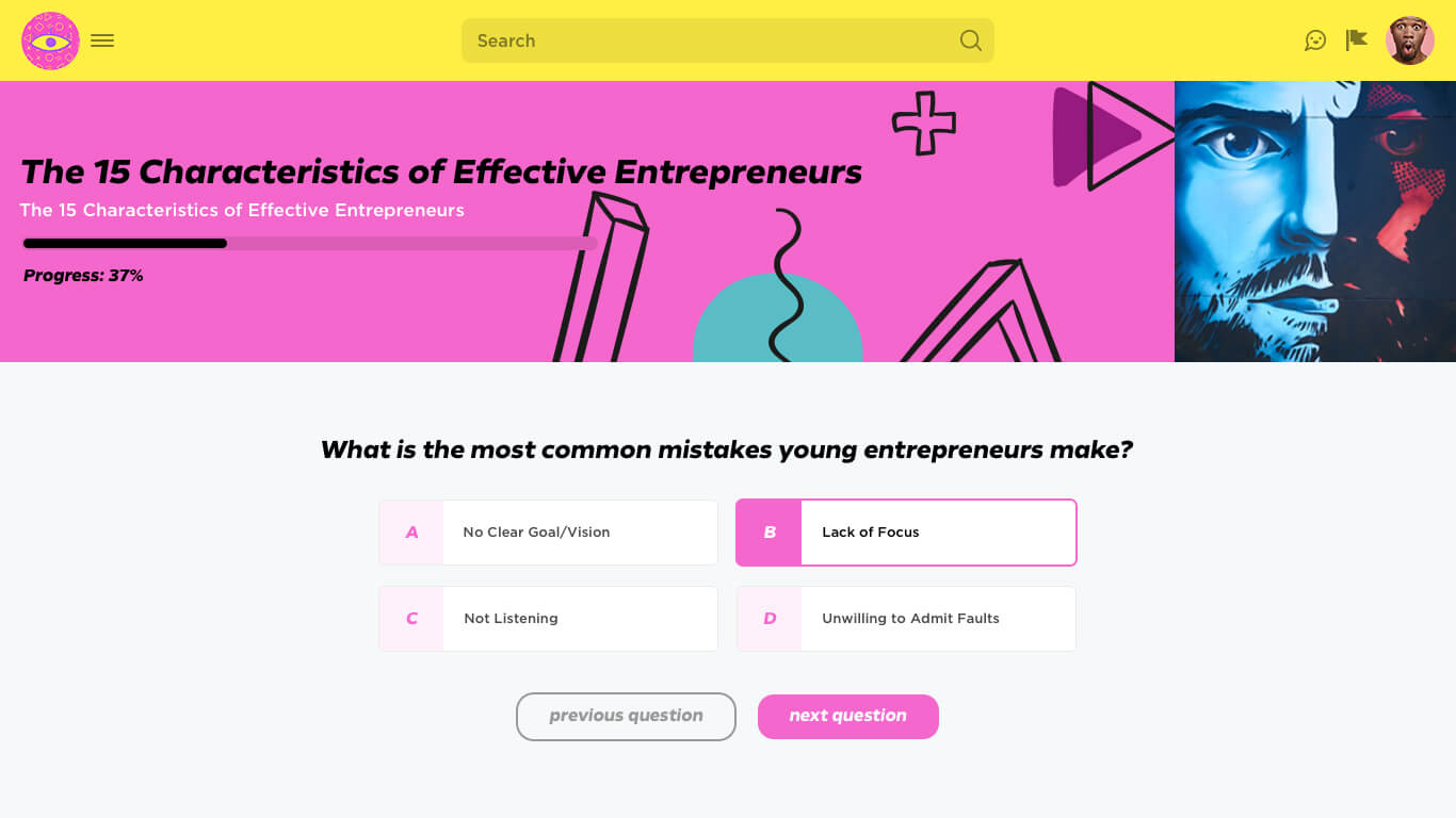
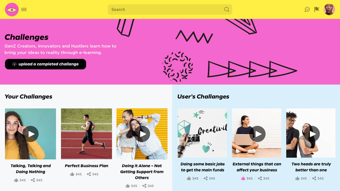
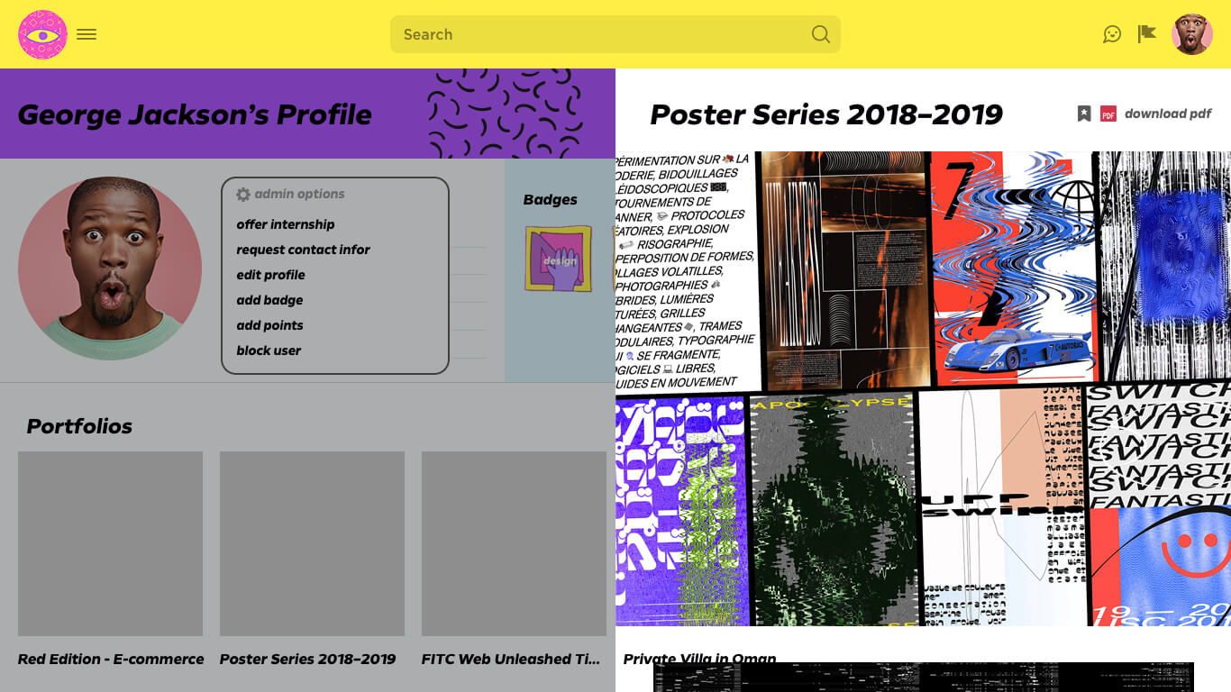
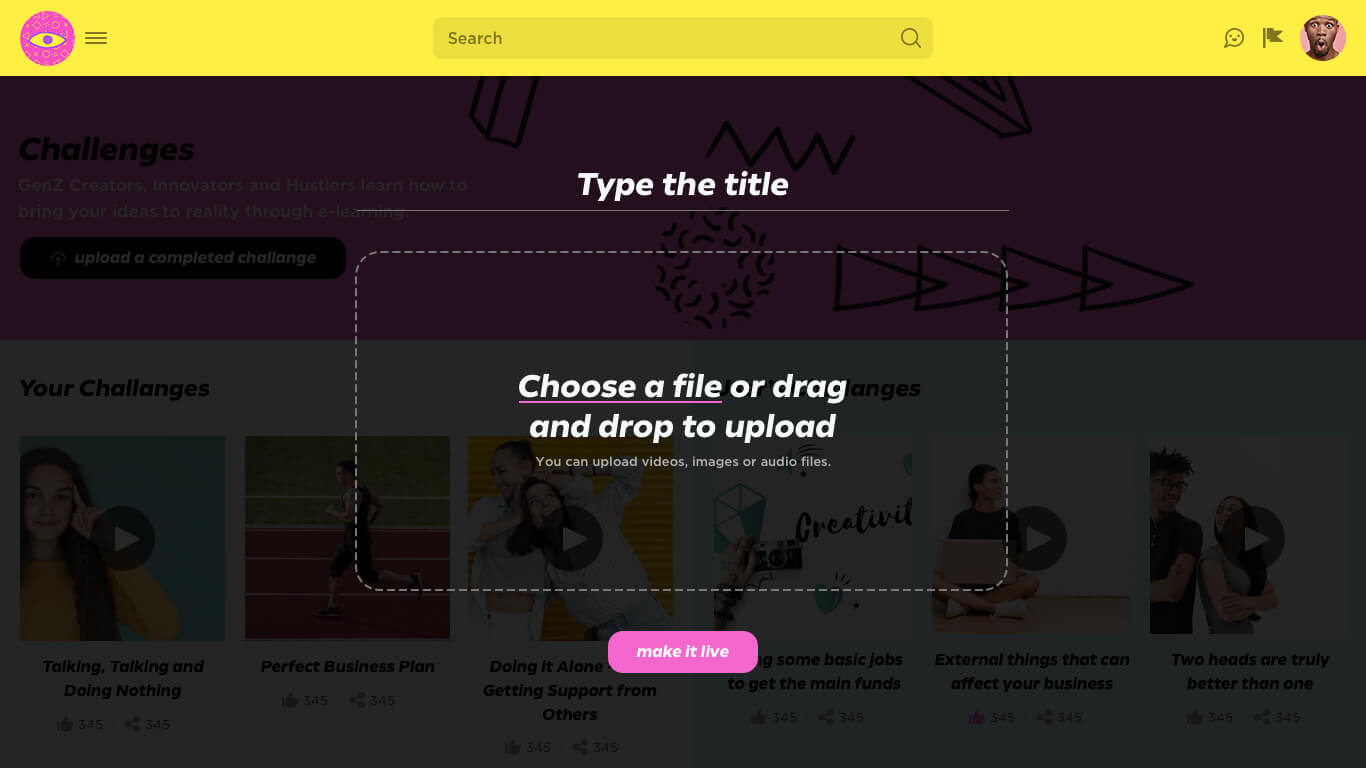
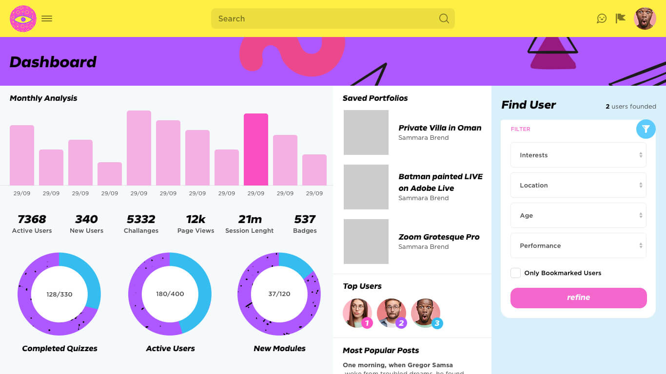
Gen Z community-based website that is very energetic and fun in terms of design. I was selected by them to adopt their mobile app design into a web format.
