Heatio set out to close a significant gap in the energy market: a simple, smart, and user-friendly way for households to track, understand, and optimise their energy consumption. I led the UX research, information architecture, wireframing, prototyping, and high-fidelity UI design for their new mobile app.
The Challenge
Energy consumption is complex, and most users struggle to understand where their energy goes and how to reduce costs. Existing tools were often technical, unclear, or overwhelming, offering little guidance or practical recommendations.
Heatio needed a digital solution that not only visualised energy data, but also interpreted it, explained it, and recommended actionable ways to improve efficiency—all through a clean, intuitive interface suitable for non-technical users.

Research & Discovery
To identify opportunities and define the right feature set, I conducted extensive market research, competitor audits, and user interviews.
Key insights included:
- Users found current energy apps confusing, cluttered, and overwhelming.
- People wanted clear, human-friendly explanations instead of technical metrics.
- Many households struggled to interpret spikes in usage or understand what drives costs.
- Users wanted personalised recommendations, not generic advice.
- Trust and transparency were important—people needed to feel confident in the data they were seeing.
These findings anchored the entire UX strategy: simplify the complex, surface what matters, and empower decision-making.

UX Strategy
Using these insights, I defined the behavioural goals, core workflows, and structural foundation of the app.
Personas included:
- Homeowner seeking cost savings: wants clarity and actionable steps.
- Eco-focused user: wants to reduce environmental footprint.
- Tech-savvy homeowner: wants detailed insights and data transparency.
User journey mapping helped establish the flow from onboarding → connecting energy sources → monitoring consumption → receiving insights → acting on recommendations.
UX goals:
- Make energy data easy to understand
- Provide personalised, actionable recommendations
- Encourage long-term engagement through clear value
- Create a scalable, structured foundation for future features

Information Architecture
I created a clear, modular structure with four core pillars:
- Dashboard – high-level view of energy usage
- Breakdown – details by time, appliance, or category
- Insights – personalised efficiency recommendations
- Actions – steps users can take to reduce waste and improve performance
This approach gave users both clarity and control, avoiding unnecessary complexity.

Wireframing & Prototyping
In Figma, I produced low-fi wireframes to define layouts, test flows, and validate interactions with the team. Rapid iteration helped refine:
- How energy data is presented
- How recommendations are surfaced
- How users navigate between detailed and high-level views
- How users take action on suggestions
Prototypes allowed for quick feedback and early usability improvements.

User Interface Design
The visual design aimed to make data approachable and calm, using:
- Soft gradients and clean whites for clarity
- Minimalistic charts and visualisations
- Friendly colour accents to highlight important information
- Intuitive iconography to support fast scanning
The UI was designed to make energy data feel manageable, not intimidating.

High-Fidelity Design & Design System
I created polished high-fidelity screens and built a scalable design system including:
- Colour palette and accessibility-checked contrast ratios
- Components (cards, charts, buttons, inputs, toggles)
- Layout grids and spacing system
- Reusable patterns for data visualisation
- Interaction states and micro-interactions
The design system ensured consistency across all screens and prepared Heatio for long-term feature expansion.

Key Features & Solutions
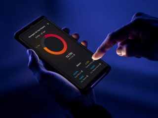
1. Smart Energy Dashboard
Problem: Users couldn’t understand their daily or monthly energy behaviour.
Solution: A clear dashboard summarising usage, costs, and key alerts.
Benefit: Instant clarity and a reason to return daily.
2. Detailed Consumption Breakdown
Problem: Users needed more context behind their bills.
Solution: Graphs and comparisons showing usage over time, appliances, and seasons.
Benefit: Better decision-making and more control over household energy habits.
3. Personalised Recommendations
Problem: Generic advice wasn’t impactful or engaging.
Solution: Tailored suggestions based on actual consumption patterns.
Benefit: Higher trust, relevance, and motivation to adopt changes.
4. Sustainability Actions
Problem: People didn’t know where to start improving.
Solution: Actionable steps with clear impact indicators.
Benefit: Transforming insights into real behaviour change.